Since as a few days ago it has been a year that we left San Francisco, I thought it was time for a post with graphs.
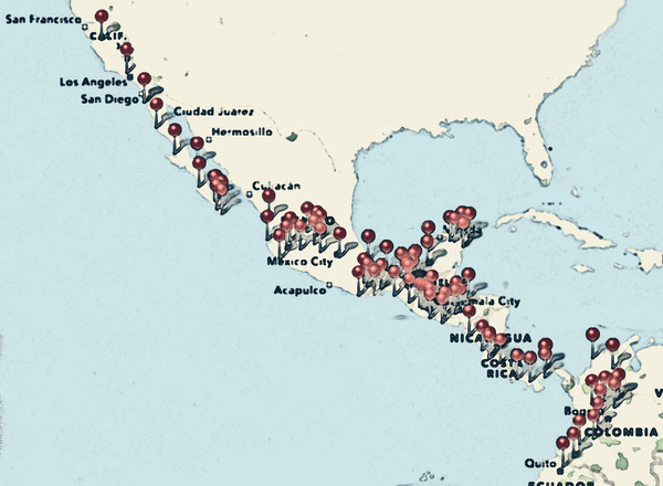
These are all the places where we got gasoline. It shows all the places where we’ve been nicely.
We drove about 16,800 miles so far, or about 45 miles per day on average (Stephanie drove about 150 yards of that distance–not that I complain.) And we’ve used just over 1000 gallons of gasoline, which means the van averaged almost 17 miles per gallon. Not bad for a one-bedroom loft apartment on wheels.
One thousand gallons of gas sound like a huge amount. But I got some perspective the other day while driving behind a gasoline tanker truck. They carry between ten and twelve thousand gallons! The gas in just one of those trucks would be enough to drive about ten to twelve years. I thought it was interesting.
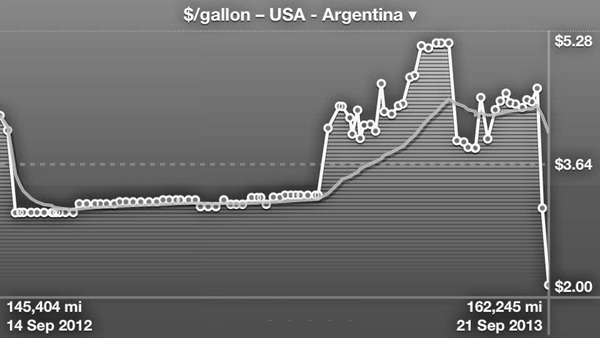
Here is how much we paid for gas in every fill up. The x axis is not time, but just each fill up:
The first two points are in California. Then comes Mexico, with its state-owned Pemex monopoly. Monopolies don’t have to be bad price-wise, I guess. In Guatemala prices were higher, and in Costa Rica they are pretty crazy. The dip near the end is Panama, and then comes Colombia. The last point is Ecuador, where a gallon of regular is $1.49 and super is $2. The second to last point was still in Colombia–the areas near the Ecuadorean border have cheaper gas, presumably to make it less worthy for people to smuggle gas from Ecuador.
BTW–Colombia produces its own oil, and exports two thirds of it. And some countries that buy oil from them have cheaper gas prices than Colombia has. Non-monopolies can actually be bad for prices, I guess.
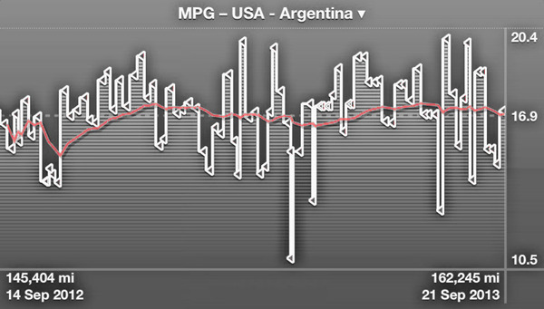
This is a graph of how many MPGs the van got along the trip:
The dip near the beginning was in Baja. I don’t know what happened there exactly, I imagine that all the dirt and sand roads we took over there had something to do with the poor mileage.
Here is a nice interactive graph of how much we drove every day. This time the x axis is indeed, time:
Because Google Docs still uses 90s technology (Flash–I couldn’t believe it either!), here is a static image of the same graph in case you are seeing this on an iOs device:
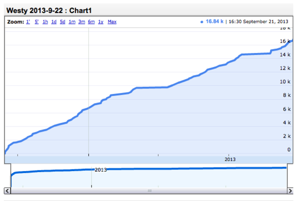
You can see the flat areas, times when we didn’t drive much at all: one is San Cristobal, and the other one is our long wait plus California trip while we were in Panama.
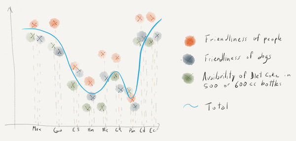
And last, I decided to draw a graph with some of our perceptions of each country so far. It turns out that the friendlier the people, the less chances there were that dogs would try to attack Milo. Also, the availability of Diet Coke must mean something. I don’t know.

Hola Juan, que lindo viaje, feliz primer año, digo, porque me parece que te llevará otro tanto llegar al sur. Los sigo con cada post, es muy lindo y educativo.
Te comento que el 29 de octubre estaré en Lima Perú por tres días, no sea que coincidamos justo en el mismo lugar, sería muy loco.
Sino es así ya sabés que cuando estés en Argentina en viaje al Sur Carmen de Patagones será una parada obligada.
Les mando un fuerte abrazo y gracias por compartir tan extraordinaria experiencia.
Gervasio! Que tal!
No se si andaremos por Lima para fin de Octubre, en una de esas ya vamos a estar un poco mas al sur. Pero quedemos en contacto, quien te dice.
Si no, seguro nos vemos por Carmen de Patagones. Enero o Febrero…
Un abrazo grande.